In part one, we ranked the first two rounds of brands that either crushed it or tried it. Now, we're onto those less successful attempts, the reasons why, and remedies…
Tier 3: GAVE IT A GO
Michael Kors Collection
Michael Kors's overall creative strategy is deeply challenged. While you could overstate the uncertainty from the Tapestry / Capri merger, with sales down 12%, how Kors goes, so goes Capri.
So, it’s worth comparing how Michael Kors and Ralph Lauren approach the same challenge. Ralph Lauren is a masterclass in brand management. While the different divisions are distinct, they share a clear connective thread embodied by the campaign in Tier 2. The Ralph Lauren campaign has a trickle-down effect on everything else.
As Ralph has soared, Kors has plateaued. Michael Kors's Collection is designed to do the same job for the brand. The challenge is that the campaign implies a divorce from the leading brand rather than the apex of what Michael Kors is. While it’s elegant and simple, it is divorced from the brand. Existing above and beyond the jet set. The campaign named “timeless” (natch) speaks to a brand that doesn’t know if it wants to follow trends (quiet luxury) or continue burrowing into the jet set.
Which, in itself, isn’t a choice. Kors can do both - if its ethos is clear.
This is a fundamental problem because the rest of the brand is still built off Michael Kor’s crisp ethos of jet set. That imagined jet-set lifestyle is ownable, immediate, and still relevant for millions and millions of consumers. It works left to right in audiences and up and down in price points. The jet set also subsumes quiet luxury. However, the collection has to do some of the heavy lifting for the brand to bring the entire aspirational lens of the brand to life. Simply having it exist in its isolated world does not give the rest of the brand the chance to thrive. It is ‘them’ and us.’’
Without those connective threads, while Collection maintains fashion credibility it loses its ability to shape brand value, and the relationship to the aspirational part of the brand is severed. Returning to that consistency and connectivity will help the brand in the near term, becuase it gives the wider parts of the Kors business a chance to elevate up without getting rid of the overall allure.
It’s not like Kors has always been off track. For a solid decade, the brand was a marketing innovator and made its presence felt. While times and audiences have changed, the ethos remains alluring. The jet-set isn’t going anywhere. In many ways, it’s been democratized, especially through TikTok. 37% more Americans travel to Europe than in 2019. But Kors’s connection to that need and desire for escape isn’t clear. Their most recent beach club activation, was in all places, Miami.
Jet-set (ish).
A reconnection and articulation of these two worlds can start the process of not just engaging the luxury consumer for collection but acting as a trickle-down for the aspirational consumer. It’s all there for the brand to re-connect with. But the time to do it is sooner rather than later.
MCM
“From Munchen To Mars” really surprised me. MCM is a brand that, in many ways, exists. You know it. Your opinion of it might be neutral. In that way, those brands need to work harder and more creatively to create attention. Hence, going with a more conceptual take. Collier Schorr’s execution elevates the narrative and the products.
But it also came with its plot twist. The second page of the Vogue spread was AI-generated, which I only realized after reading the press release. I'm honest. I’m not sure what to think about it. It certainly shows the rapid evolution of these tools and doesn’t detract from the overall story. In a world of AI slop, many brands seem to be running towards it. It’s good to see a brand put some effort and thought into generating the execution.
H&M
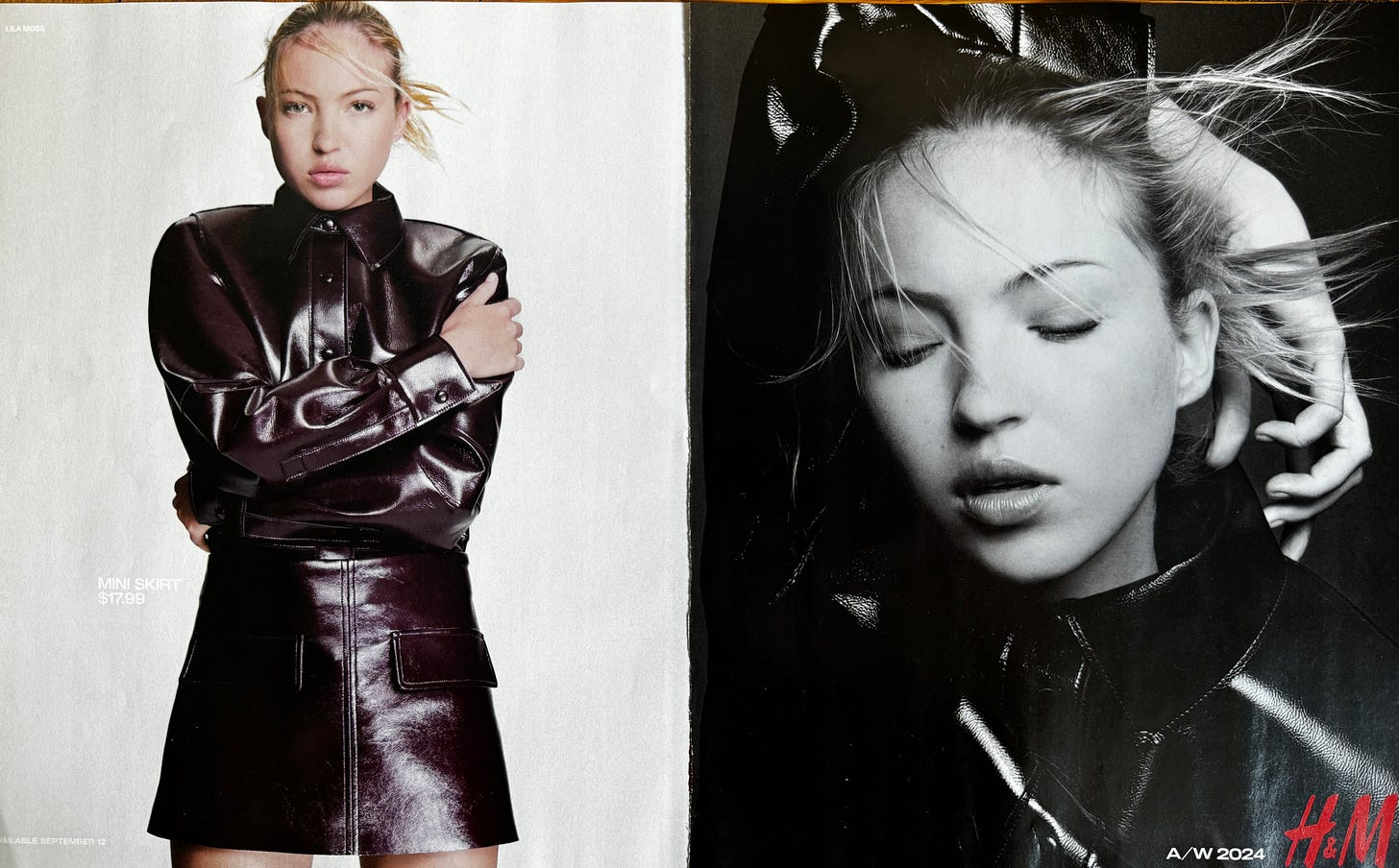
The H&M fashion renaissance is here. Another brand undergoing a brand elevation strategy would naturally gravitate towards simple, clean imagery executed well to communicate the start of that elevation journey. The multiple-page campaign is designed to signal change. With the news that Charli XCX is working with the brand for some extravaganza at London Fashion Week and starring in a fast-follow-up series of photos from the same, there’s a coordinated plan to activate fashion credibility and revive cultural relevance.
No doubt it’s a significant investment (You can see the entire shoot here), but when you’re under pressure the way H&M is, you have to make some bets. Maybe it’s an audience of one, but H&M, as opposed to Mango or Zara, still has the stigma of cheap rather than stylish value. The elevation in marketing will go some way to shifting that perception, at the least resetting an expectation of the consumer. Still, I’d be interested to see if they can develop and own a consistent design and art direction language rather than jumping from location to location to service the product. Creative discipline will help augment product clarity. This, 1.0, seems to be where the team is headed, as Women Wear Director Eliana Masgalos stated.
"It's great clothes: real wardrobe icons. The campaign lets the fashion shine,"
Let’s see what the Charlie XCX partnership delivers…
Tier 4: GAVE UP?
Ok, let’s get into it…
Levis
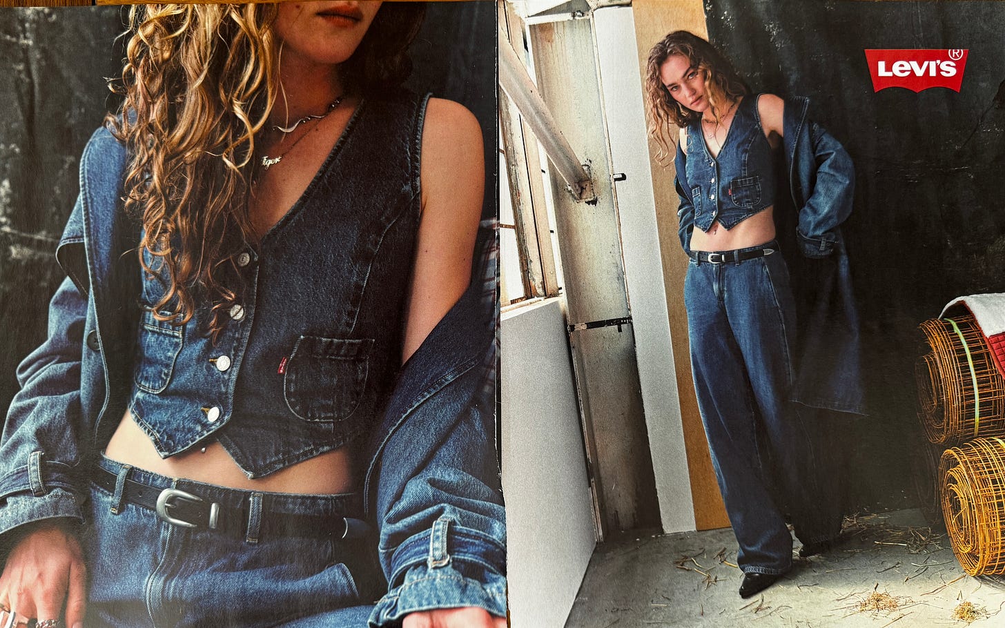
For the first time in a while, I’m concerned about Levis. (Yes, I know that’s an overstatement for a print ad in a magazine.) In contrast to Gap's distinctiveness, Levis lacks a certain frisson and tension.
While the brand is in a new phase of its journey, cutting positions and revamping its store footprint, the initial creative work under this new guise has somewhat shadowed Gap. Denim and dancing, dancing and denim.
I’m on record as loving the 150th Anniversary campaign. I thought there was enough longevity to carry it on—telling fun, incredible stories of why the brand mattered then to support activities of why it’s relevant now.
Live In Levis Now, and Lived In Levis then.
But it seems clear this isn’t where the brand is going. Relevant product streams (Made & Crafted) have been discontinued. LVC is a shadow of what it once was. The product portfolio is narrowed. Admittedly dormant for years, even RED gave the brand character and flair. They treated Denim as something both they worshiped and cherished and something to fuck with and play with.
That tension filtered down into the creative work—not just the ads we all know and remember, but in the styling, the photography, and the sensibility that there were multiple avenues into Levis world.
The September issue print ad (which I couldn’t identify as part of any singular campaign, is a helpful vector for this listlessness. Whereas Gap has not just brought cultural relevancy to its brand with Troye, the product and the styling sing. Not so here. Even The Levis Collective, an exciting thought with apparent ties to both the central brand idea and the concurrent idea that Levis has always been for the young, delivers an equally flat and uninteresting sensibility - almost shot for wholesale rather than the master brand.
The truth is that a big idea demands a sense of grandeur—either in the concept or the styling. Gap has balanced scale, imagery, styling, and concept. Levis has to deliver the same thing.
For many, Levis isn’t just a denim brand; it’s something deeper and more meaningful. The brand, like its tagline, never goes out of style. 501s are making a comeback as the wide-leg jeans maintain their dominance. The mid-rise jeans are back (so are bootcut, it seems...) Levis washes are still everywhere. Even Engineered Jeans and RED have a second life in resale. The pieces are all there for Levis to push for relevance, but it has to think bigger and deliver elevation in the style and fashion to deliver on the promise.
Gucci
For months, I had an idea that would go into this Substack. Called ‘the case for Ancora,’ it articulated a rationale for sticking with the initial rollout of the Ancora brand idea, which launched the ‘new’ Gucic’ in a flurry of Rossa Ancora red.
My thesis was that ANCORA represented a clear-eyed concept that could drive communication from the brand outwards. It was a reset, a cleaning house, a palette cleanser, and a platform to constantly build and invent new ideas from their existing forms with clarity, flair, and purpose.
I never published it.
Not because there isn’t anything fascinating about the idea of ANCORA. The initial discipline of the rollout enticed and intrigued. It delivered attention, and it bought time. I didn’t publish because I came to the conclusion that the brand cannot ground itself into one cohesive narrative. ANCORA has never been genuinely defined beyond a first flurry of activity, leaving the brand weakened and obtuse.
ANCORA (loosely translated into ‘again’) was a conceptual scaffolding for the brand they could have built upon. As De Sarno himself stated,
"Ancora is a word you use when your desire is not over yet, whether it's a kiss, an embrace, or making love; it's as if you own something and you want more of it. I wanted to fall in love with fashion all over again – ancora."
A distinctive color palette, anchored in the brand, allowed Gucci to keep adding to a monolithic idea—Kubrickian in its scope. An example of this layered thinking appeared in De Sarno’s show notes for the Cruise show in May.
"Red is actually everywhere at Gucci. The very first Jackie bag was black with a red lining. I went to the Savoy Hotel, where Guccio Gucci worked [as a young man before founding his company], and the elevator inside is red."
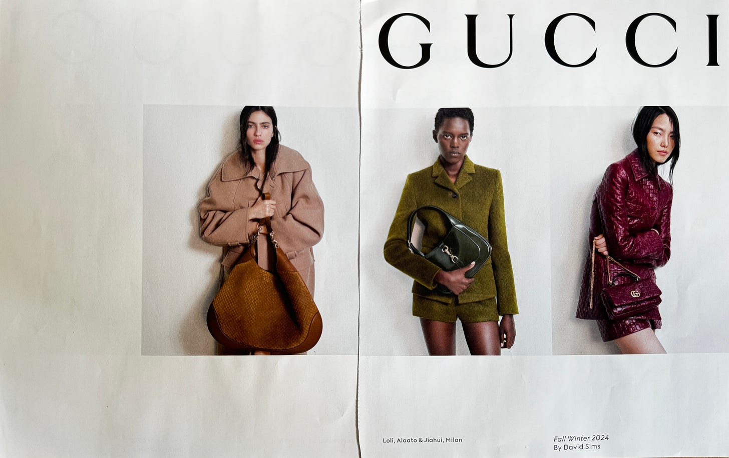
But none of that has come to pass consistently. The work sometimes flits from ANCORA to other core concepts. It is tactics over strategy. Within the context of the magazines, The editorial strategy from 2023, which sought to take over every fashion magazine worldwide, was a far more interesting play than what has occurred this season. Instead of getting more explicit, the idea has become foggier, leading to a print campaign that says nothing more significant about what the brand stands for.
Whether it’s competing visions, too many voices, or not enough voices from on high to say no, the vision seems listless. Ancora is an idea that allowed Gucci to create interest in itself and see its icons anew. Creating the conditions for consumers to eventually embrace the core elements of De Sarno’s aeSarno's world by seeing it in a new context. But the brand, embodied in its print ad, has strip-mined its distinctiveness. What Ancora represented as a possibility isn’t their tension - it is clothes and products presented in a fashion that exposes their limitedness; it doesn’t have context, and it doesn’t have a universe in which Gucci exists. The cost, a $3000 jacket or a brothel creeper horse-bit, can’t be justified, especially if mass retailers can effortlessly mimic the colors, designs, and ideas.
There was, and remains a monolithic quality to ANCORA and rosso color, that I find compelling. A bulwark against noise. Immediately defianble and with intention and discipline, ultimately defendable.
Ironically enough, ANCORA has worked far more effectively away from the clothes. Design ANCORA at Salone Del Mobile is a case in point.
But in the clothes, it’s meandered from tactic to tactic. From Kendall and Bad Bunny ‘hard launching’ their relationship in an airport (a nod to Gucci’s 1970s jet-set style) to the bizarre ‘Gucci Is A ‘ Feeling’ or the Head collaboration (an example of a luxury brand trading down with very little value attached) to, as has been pointed out, another David Sims execution this September. There’s a disjointedness - a clear articulation of what ANCORA is and how it operates within the brand could help guide the choices and tactics it creates.
Kenneth at The Impression probably says it best regarding the campaign at large:
Consistency is rarely a bad thing when it comes to campaigns. But when that consistency feels lacking in point of view and just shows us the same white wall, maybe it’s time to change things up and take a creative risk? We might be nearing the end of our patience with Gucci’s transitional period. The slate has been wiped clean – now it’s time to fill it with something new
I remain hopeful that a summer of clear heads will create a marketing structure that clearly states and delivers on what ANCORA can be for the brand and builds meaning for the consumer.
Louis Vuitton
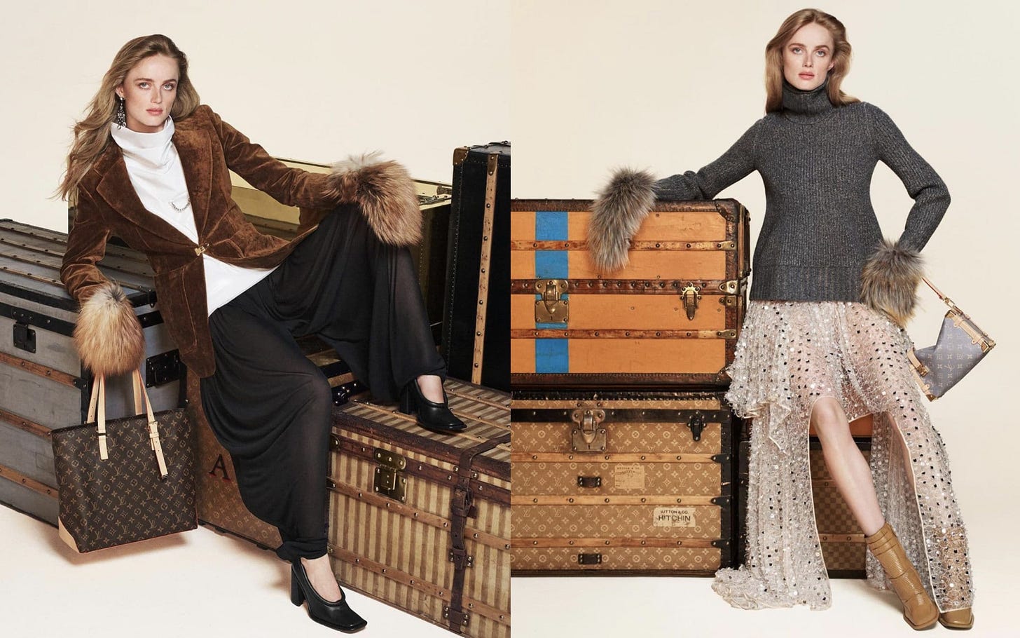
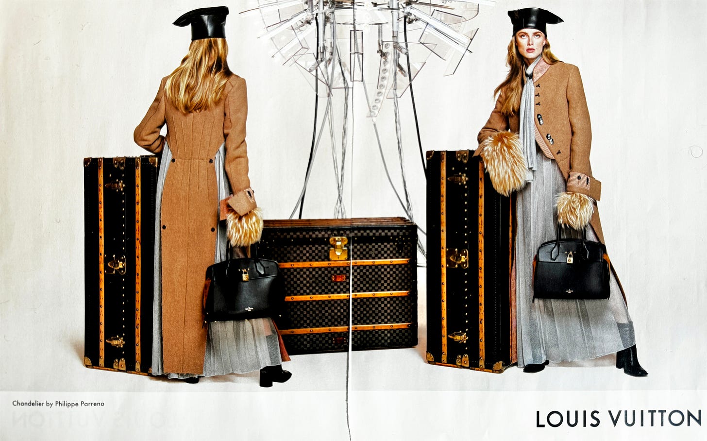
What’s happened? Vuitton comms for its RTW used to be great! There’s the usual guff about the campaign, surmised in the Impression:
An intersection between historical heritage and forward-looking futurism through considered set design that makes use of two distinctive elements. The sense of history is present in the selection of antique travel trunks, which date back to the house’s earliest years. Meanwhile, a futuristic lighting fixture made of steel and glass – the same one featured in the set design of the collection’s runway show – creates a slick and angular juxtaposition with these design artifacts.
Yet a look at Vuitton’s communication archives of the Ghesquière period reveals some absolute bangers and genuinely innovative thinking.
Specifically the ‘Series’ campaign.
The Series (X) campaign was as sharp as a tack. The clothes leaped off the page and screen as both alluring and clear-sighted. Design vision and marketing vision are in lockstep. This is world-building, where the context and clothes are deeply intertwined. Each execution, through the lens of the different photographers, built a wider whole. The various angles simultaneously demonstrated the commonalities and distinctiveness of the product.
The series' continuation gave the brand more scope to explore and innovate. The Series 4 campaign featured Final Fantasy’s Lightning, a genuinely disruptive choice, years before the brands talked about tapping into fandoms or leveraging AI and CGI to execute work. This was luxury brand communication as far-sighted explorations of intersecting cultural lines.
Yet now, the women's campaign seems smaller in its creative vision and what it wants to express. Say what you wish about Pharell (as I have regarding his Ralph Lauren/RRL cosplay last season), but there is at least an idea here; he’s building a very clear world for men to exist in. and this half effort from a brand that can demand more and deliver more than almost any of its peers is a strange abdication of creative verve.
Maybe it’s time to bring the Series idea back. Or maybe at their scale, it simply doesn’t matter anymore.
Chanel
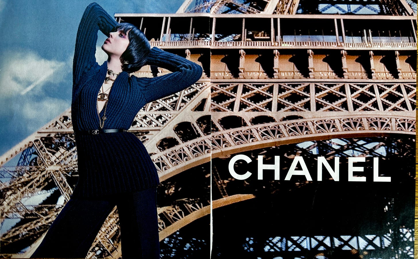
When you compare the striking, powerful, instantly iconic imagery that Lagerfeld created for the world of Chanel, you realize how far Chanel is from a clear creative vision of itself. The casual tourism of Paris here as the backdrop makes the brand feel smaller than it truly is. But, maybe that’s what’s to be expected right now. Chanel has a long legacy of incredible conceptual creativity, from the shows to the campaigns. (AKA The Surfboard Ad, below). Those things were almost collectibles but were also worldbuilding's apex.
You can get away with more orderly campaigns for beauty, watches, etc.… However, RTW is the most tangible, powerful brand perception driver because Chanel has extraordinary permission to push boundaries and create worlds where people want to immerse themselves. There’s probably no other brand on the planet that can bring its customers and fans along for the ride quite like Chanel.
With the news that Simon Porte Jacquemus is the front-runner for the vacant role, you’d like to think that the return of bold, clear, and fun Chanel is close. It’s the ultimate brand universe builder - it’s time it returned to it.
LUISAVIAROMA
The rollout of this store launch has been bizarre - and this ‘too cool to try’ concept doesn’t bode well for the store at large, especially when there’s a Barneys-sized hole in New York retail that needs to be filled.
I didn’t click on the QR…
I might have gone a little long here… However, the depth of these campaigns' revelations about the brands that commissioned them is fascinating. A sense of timidity drives those with the most to lose. But it’s on the brands to reclaim their creative edge and choose print as a moment to create a statement of intent about who they are and why they exist.
Maybe then, we can drop the (s).


