The September issue.
Once a cultural cornerstone, the subject of documentaries, and baited breaths when the newest cover star dropped.
The September issue for a brief moment in time, was a cornerstone cultural moment. It’s myth, accelerated by the deft hand of Anna Wintour in the now remarkable curio ‘The September Issue’.
What powered the myth-making, wasn’t just the big personalities and big budgets, but it’s bigness on newsstands. The size of the thing was actually the thing.
Consider the 2007 Vogue that boasted 750 pages. Or the 2012 version that topped it with a whopping 912 pages.) Of those triple-digit weighty tones, most of the magazine was dedicated to what Vogue and Conde Nast were good at - Selling ads.
The September Issue acted as an annual check-in on the great, the good, the grifters and now-goners of fashion, beauty and lifestyle brands that made up those ad pages,
For the brands themselves, September was a time for grand indulgent affairs - capturing eyeballs and prising open wallets, with brands conceptually leaving it all on the field. Everyone, won.
But times, as we know, have changed. This September’s issue has lost its place at the high influence table since the pre-social, pre-pivot-to-video, pre, well anything era. This years September Issue arrives as light slap, rather than the booming Asgardian thunderclap of yore.
While the page numbers might have shrunk, it still offers a barometer - a temperature check of brands and ideas that are on the rise, and brands that might need a bit of a tune up. Because for all that, the data bods, social mavens, and AI slop advocates will tell you, print, to many in this industry, still matters. it connotes an elevation, and status, that might not drive sales, but can still drive clout. (When it wants to).
We took this approach with Esprit, using the September issue(s) to announce our renewed (and sadly all too brief) return to the fashion landscape. We bought at places we knew had scale (Vogue / Elle / Harpers), those we knew had credibility and opened doors to different markets (L’Officiel / W), and niche brands that gave us surprise and low-cost value. (Flaunt / 032c.) Print was a dynamic medium we used to set ourselves up and deliver credibility out of the gate.
So, the September issue measures a brand’s psychic health—a window into how one sees itself. But it also reveals issues and faultiness. Creative verve or creative stagnation? Product clarity or product confusion? Relevance or irrelevance to the audience? Clear-sighted or lost in the fog, trying to decipher the problem?
It’s all there - if you know what to look for.
The only way to add further subjectivity to a subjective idea was to borrow from sports and the power rank (most) of the players on the board. It’s not a rundown of every single advertiser in the issue. But selected highlights merit a deeper dive, creatively or strategically.
Tier 1 - GAVE US THE HEAT
Tier 2 - GAVE IT SOME WELLY
Tier 3 - GAVE IT A GO
Tier 4 - GAVE UP?
Ok, let’s dive in:
Tier 1 - GAVE US THE HEAT
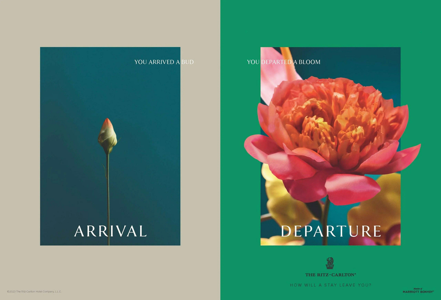
Ritz Carlton - “Leave Better”.
Maybe it’s sacrilegious, but the best pure concept in the entire book isn’t from a fashion brand. It is a vivid demonstration of what a clear brand idea can deliver. While it works phenomenally well as a print buy, it extends beyond the medium to speak to multiple aspects of the Hotel experience.
By leaning into metaphor, I understand immediately what a better stay feels like. Hotels are about transformation. With that ‘leave better’ lens, not only is Ritz Carlton creating a reason to choose their experience, but you create free associations to the idea with your own experiences. I’ll never forget the personal highs (staying at Le Bristol in Paris, where I proposed to dear readers) or the professional ones (the Emiliano in Sao Paolo (where I stayed while working to win the global Schutz account). That free association is critical and can help dictate consumer choice.
Ritz-Carlton has always struck me as a good but not extraordinary luxury hotelier. Campaigns and ideas like this that speak to the viewer's sense of taste and discernment can help encompass the entire gamut of experience for the brand. Like Mandarin Oriental’s 'They're A Fan,’ long-running campaign creates a shorthand and familiarity. I also appreciated that the business had done the heavy lifting of sprucing up its operational and digital experiences before coming up with the idea, helping to validate and back up the claims.
Chloe
The David Sims paradox of the September issue is upon us. Recently, Fabio Becheri pointed out a clear trend of repeatedly using the same photographers for effectively the same campaigns. This isn’t a new thought but highlights something that has become a fait accompli and timidity in the current business moment.
David Sims dominates this September issue. However, the irony of Sims dominating the lensing landscape demonstrates the brands that know who they are and those that are floundering. Good or bad, it shows up in the photos.
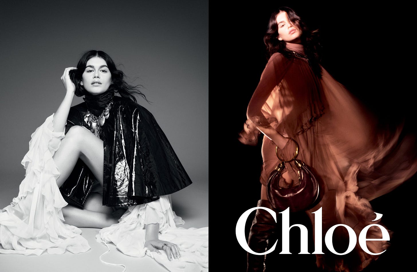
Sims's work for Chloe shows that the brand is on the rise. It’s a stunner. That logo hasn’t looked this good in a while.
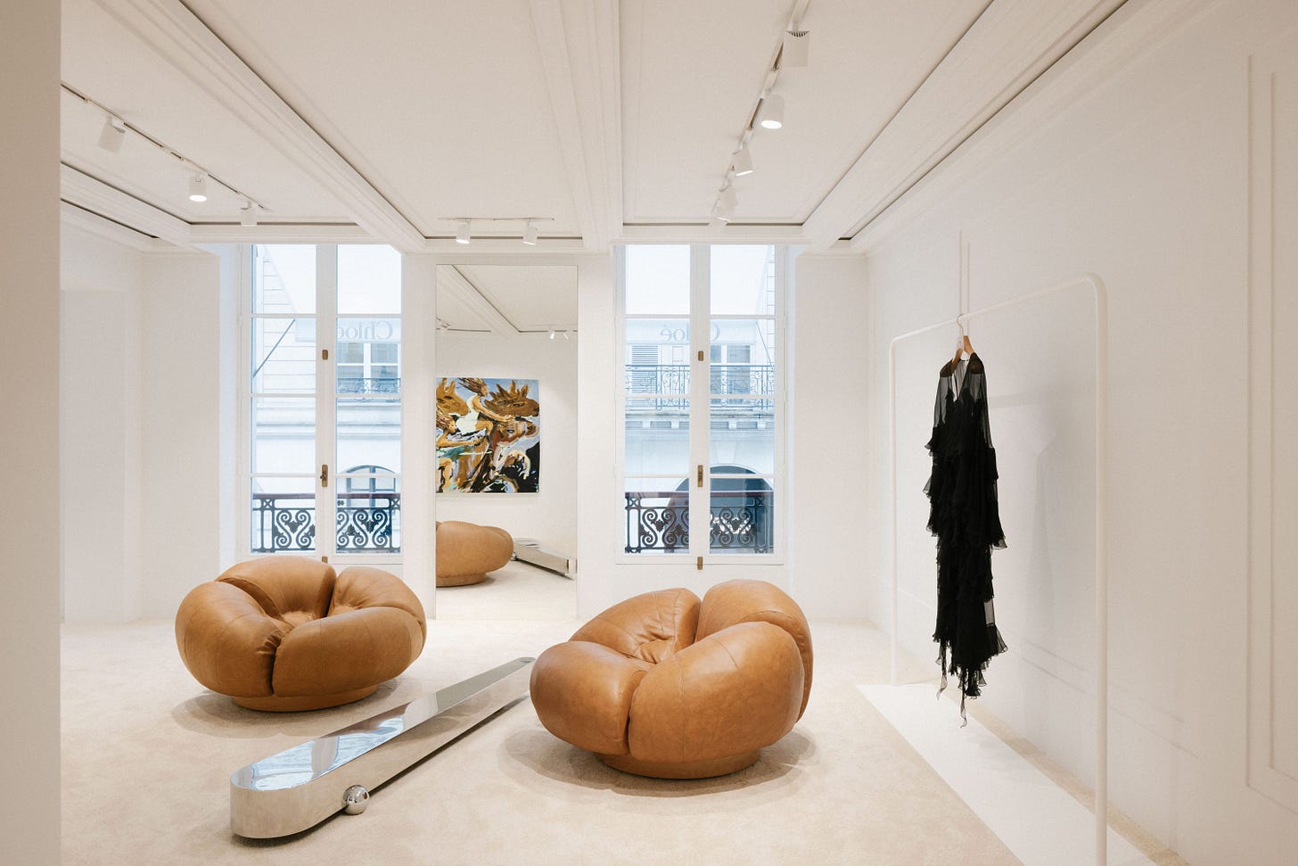
In Paris for the Olympics, we took a trip to the flagship store on Rue Saint Honore, and the store oozed confidence. Light, airy, calm, and a tension between masculine and feminine moments. It was merchandised perfectly. Everything felt balanced—nothing too outré or cluttered. The store was augmented by becoming an exhibition space for Danish artist Mie Olise Kjærgaard, with the brand's newfound energy coursing through the new space.
This clarity of product and brand attributes is now filtered through the advertising. They’re straightforward executions but ooze a distinct vision for the brand and the woman it’s speaking to. It’s got hints of the 1980s in the sheer dresses and the styling, but what comes to the overall world where Chloe wants to place its buyer is a bold, confident, ethereal world yet powerful. It’s so crisp. Perfectly articulated by Chemena Kamali herself.
“With these images I wanted to capture a cinematic intimacy,” shared Kamali. “The Chloé woman is at the center, her aura, her direct gaze, and personality draw you into an eternal Chloé moment.”
The models Diane Chiu - Kaia Gerber - Rianne Van Rompaey - Rosalieke Fuchs - and Yar Aguer create their world in the darkness, reminding me of the more striking visuals from the 1971 Giallo ‘Woman In' Lizards Skin’.
It stood out immediately on the page, and its cohesiveness was validated in-store. The cohesiveness will undoubtedly help the business grow and sustain itself positively. As a pure piece of creativity, this rocked.
GAP - “Get Loose”
The September issue grouped specific brands into clusters. Its denim section was one example, with Rag & Bone AG, Levis, and Gap all together—a helpful comparison and contrast.
But it was Gap that stood alone.
Troye Sivan is exactly the type of modern-day personality you want in the Gap brand. It’s contemporary, cool, but also welcoming and visually striking. Having experience creating multiple Gap campaigns, I know they are always at their best when they strip it down, but something still holds your attention visually. We always felt ‘the white space’ of the brand was critical. But what I love about where this work has evolved is that it still feels like that white space, but it’s added depth and context. It becomes the language of the brand. The Invisible Dynamics approach infuses cultural ideas within the work. It makes them Gap, rather than creating something as Gap.
The brand is also at its best when stills and video are on equal par. Too often, one or the other has dominated. We strove for equal footing, and the run of Gap campaigns has understood the elemental role image plays in driving traffic at retail. Dan Martensen truly understands how to shoot denim, and paired with the outtake from the film, you feel like the entire experience was thought through, cohesive, and straightforward. See the video and buy the product.
Gap (Inc) and the brand are genuinely finding their feet, with their second consistent quarter of growth reported last week. As I’ve said before, confidence breeds confidence. The Get Loose campaign is an embodiment of that energy and belief.
New Balance
I initially had this in Tier 2, but the more I thought about it, the more it stood out and connected so well with the idea of Made In The USA at large. Here’s an example of what happens when a brand is feeling itself. The creative doors are flung open, and the confidence radiates from the results. Not only is New Balance on a tear (see the recent Loro Piana x 990v6 collab), but the brand feels like it has both performance and lifestyle divisions humming. This allows them to feel like separate worlds but never in competition. (If you’re not following New Balance Lifestyle, you’re missing out).
The Made In The USA campaign is exactly why print works when utilized correctly. Crisp, clear, striking images, reductive, clear messaging—it’s got it all.
Tier 2: GAVE IT SOME WELLY
Burberry
It’s no secret that the brand is struggling (most recently losing its FTSE 100 status). According to the WSJ, Since late 2017, Burberry has spent more than £700 million on investments to make the brand seem more high-end, including expensive store refurbishments. That’s a lot of money.
There’s a creeping sense that new imagery will be more stripped down and check-centric going forward. You can feel the deft hand of a reset, certainly in social. There are explainers of the history of the knight, the check, and the trench. The building blocks of Burberry.
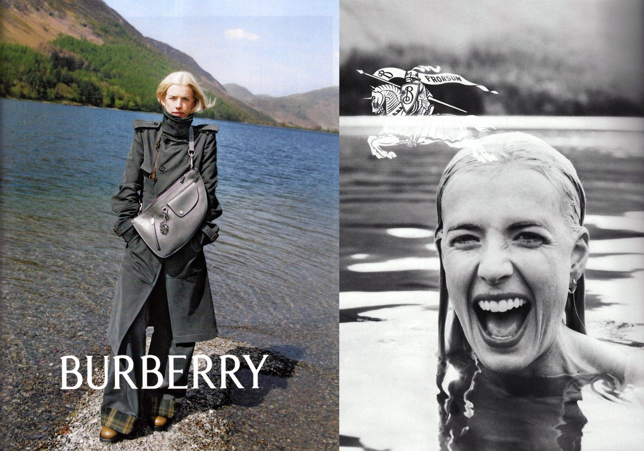
If there are evolutions coming, then the images from the September issue demonstrated what this version of Burberry, at its best, could communicate: a very British sense of humor and joy that the brand can and should hold onto.
It’s been embedded in the brand’s imagery, from its holiday work to its most recent kids' campaign. As Elena Kirsohova on LinkedIn pointed out, that kids’ campaign captures a warmth and spirited sensibility that some earlier work missed. In the image selected for the September issue, that sense of fun, some of that fun and not taking yourself too seriously, came through.
But alas, the image above is one moment within a broader campaign that seems to return to a po-faced world where the brand's distinctiveness is reduced. Burberry isn’t front and center; the surroundings subsume it.
That’s why the print ad, to avoid overloading it with too much meaning, reflects an ‘always look on the bright side of life’ sensibility that, instead of being the end for this visual world, should be a chance to refine, reshape, and build on it. We might be buttoned up culturally, but we don’t take ourselves too seriously. That’s the magic and tension that the campaign and the brand should reflect.
I remain a believer in Burberry's marketing idea. Incoming CMO Johnathan Kiman will almost certainly rethink elements of the strategy. However, like its contemporaries, the marketing must state what makes the brand special to give the product the clarity and lift it needs. It can’t be obtuse anymore; it should be direct but have depth. It has to be overt and an outwardly explicit idea of Britishness. Fun and silliness are ways out of the fog of uncertainty in marketing and creativity.
Ferragamo
Another distressed brand served up a winner by flipping the script for the rest of the season by focusing on personality and shoes. As every CEO obsesses about high-margin goods, it’s easy to forget that it takes time for brands to break into new categories and to be understood as something other than what they were. Davis’ collections might be well regarded, but the idea of the brand hasn’t come through.
While overly simplistic, this is at the heart of Ferragamo's problem—the core product they’re known for feels like it’s become an afterthought in the overall elevation story, not a lead into the brand. The bags are fantastic. The Hug Bag is gorgeously designed, with every detail well considered and cared for.
However, the shoes are more accessible for early and immediate returns. It’s as if they’ve tried to do everything at once. This is reinforced by brilliantly conceived high-concept campaigns that confuse audiences, bringing them along for the journey rather than overwhelming them with Florentine arcana. Ferragamo, even in the way it’s spoken, exudes joy.
Jurgen is a master at teasing out the personality and surprise of the product. The recurring motif of the pedestal is brilliant. His gift for observation and immediacy is something I experienced when we chose him to shoot out the inaugural David Webb campaign. In the same way, the Ferragamo story of joy is being teased out here,
There is always an inherent danger when working with Jurgen that his work subsumes the brand. And the murderer’s row of creative talent in Ferdinando Verderi and Lotta Volkova, not to mention models Peter Saville, Lina Zhang, Raquel Zimmerman, Yasmine Warsame, and Tim Schuhmacher, would have cost a pretty penny.
Still, a repeatable motif, grounded in Florence and moving methodically through the seasons and building out from the shoes, that expresses fun and joy rather than austereness might give Ferragamo the marketing exit velocity it needs to stem the tide of losses.
Moschino
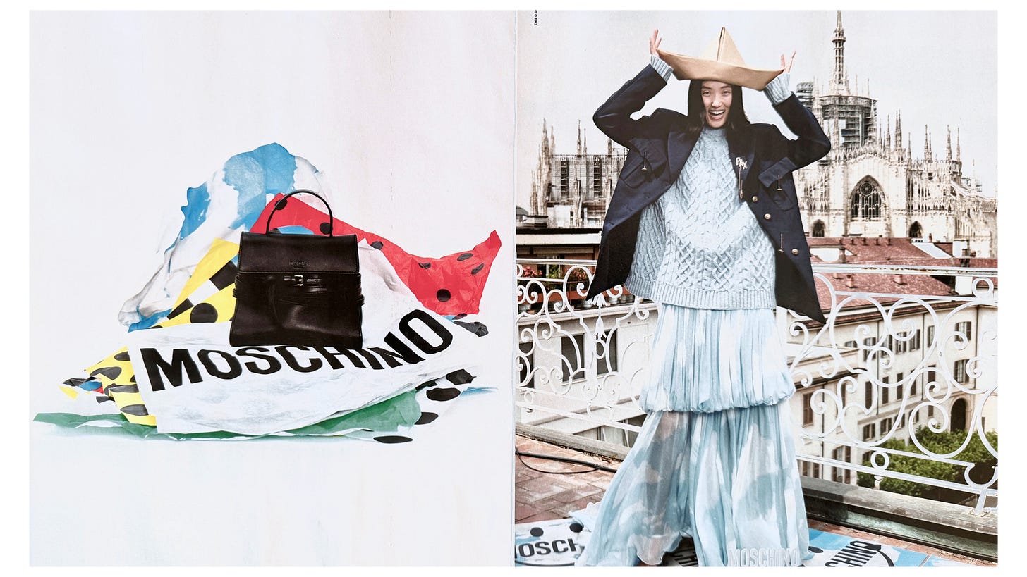
There’s something wonderfully joyous about the new Moschino campaign, with mischief coursing through it. Moschino has always felt self-contained, a door the consumer had to walk through to understand the brand. Flipping that script and putting Moschino out into the world opens the brand up, too. Maybe it’s a response to Jacquemus co-opting similar creative ideas, but it creates a new world of possibility for the brand.
It’s also a cry of defiance - after Adrian Appiolaza took over for David Rennie, who died ten days into the creative director role. Tragedy imbues this campaign with a joy that leaps off the page.
Ralph Lauren
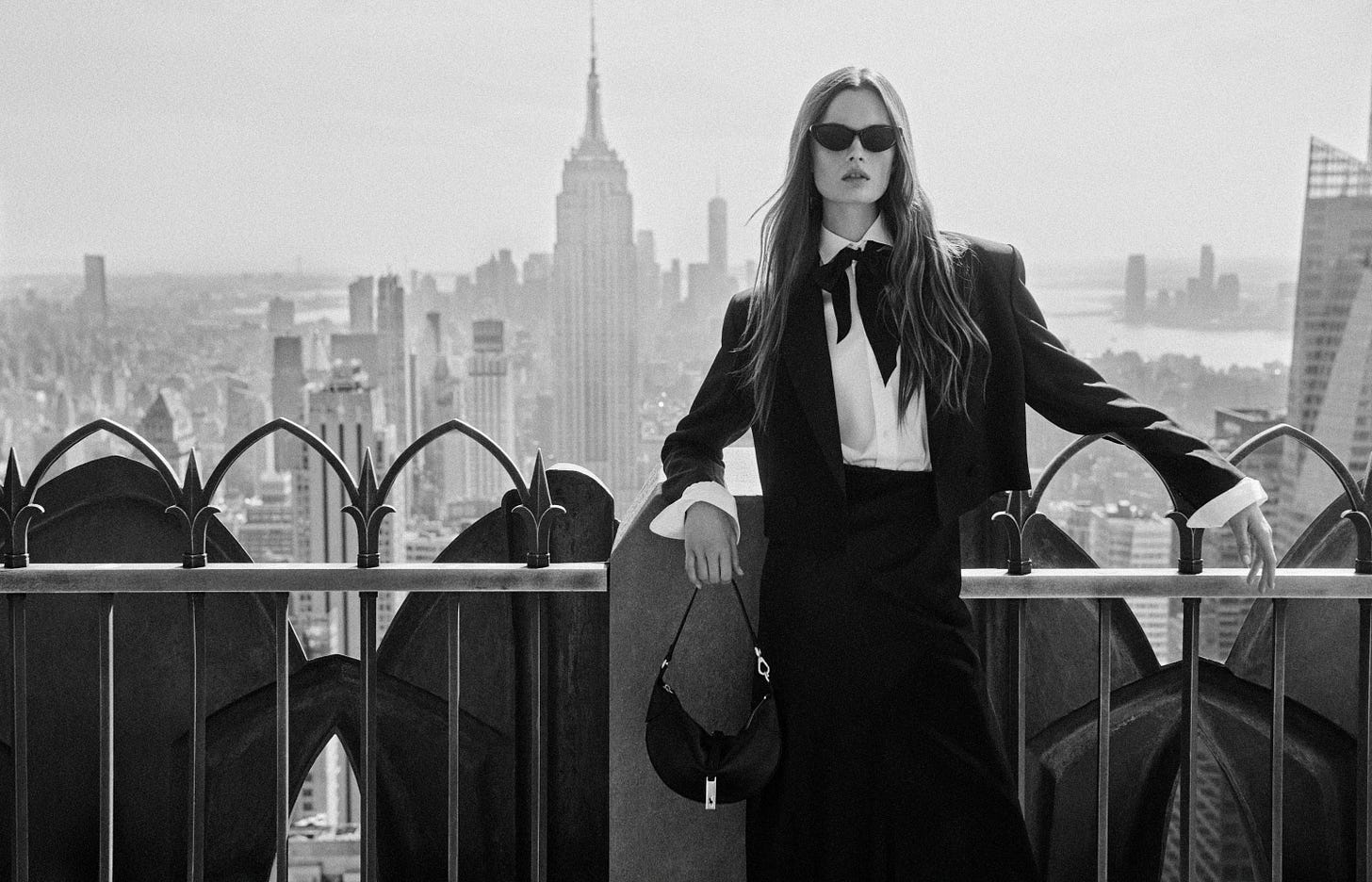
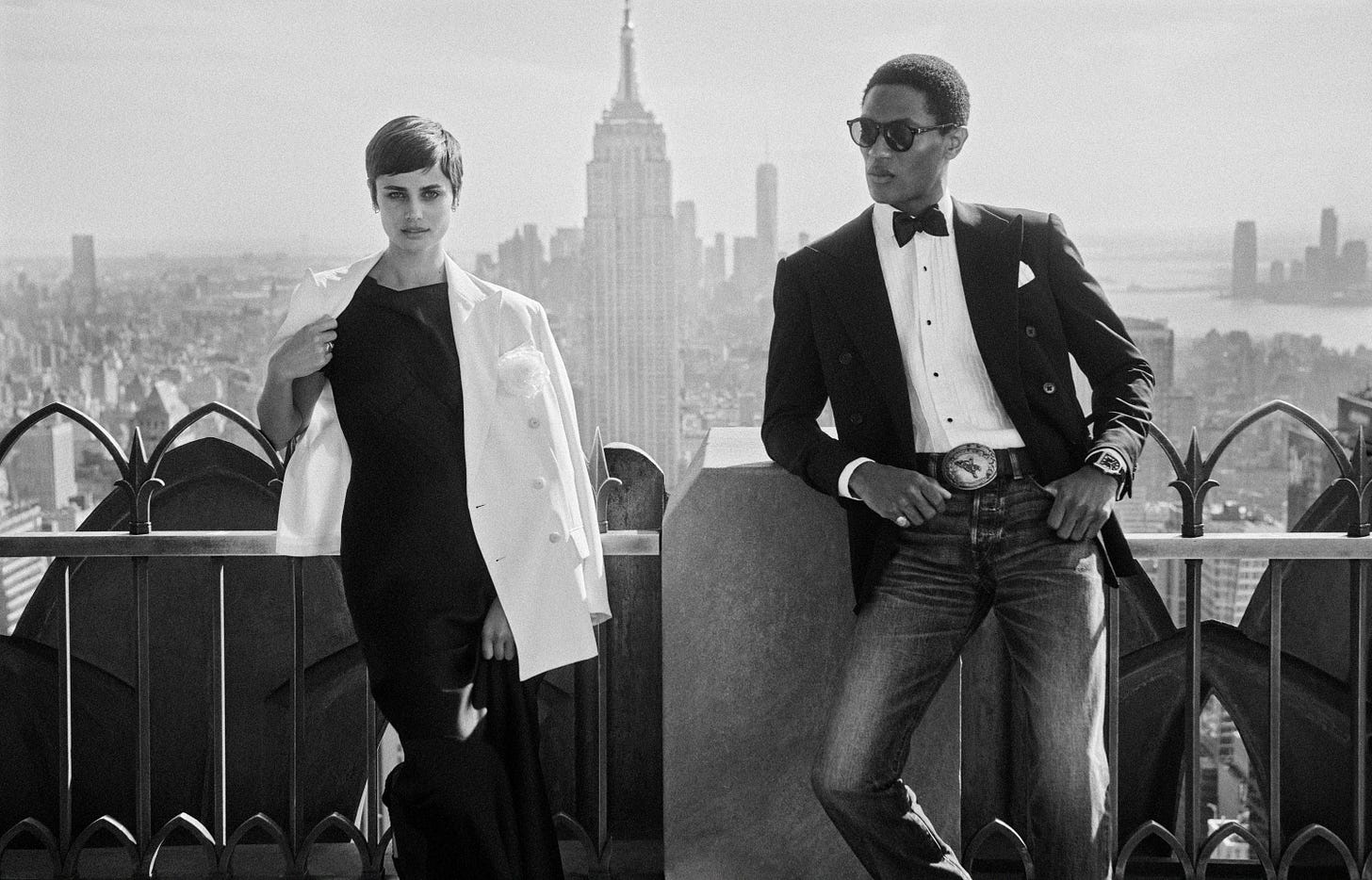
It’s all shockingly straightforward and clear. I love what Ralph Lauren is trying to do here: it feels like a coda—covering old ground, going ‘back to the neighborhood,’ and seeing everyone again before it’s time to say goodbye. Whether that’s the case or not, there’s just something so elegant about the idea of New York that he’s putting out into the world that certainly makes me fall back in love a little bit with the city.
Alexander McQueen
While many were questioning Alexander McQueen’s credibility after Sean McGirr’s McGirr's divisive first show for the brand. The second major campaign from him and the brand started to put some teeth and ideas into his version of the brand. And it’s all the better for it. Moving away from gothic Highlands, Eli Roth meets Wicker Man, to something more London and spiky. (Literally and metaphorically). Black and white helps. It feels like these images come from a Cafe Royal Book Series. Both are timeless and of their time. I loved the implied violence and jaggedness from which the brand was born. McQueen is a hard ass, tapping into romanticized subcultures.
Prada
I wasn’t going to write about Prada until this week when the second half of the concept dropped. This reminded me of why a) Prada is so good at this and b) the value of an interconnected idea—even when you’re leading with print.
The Miranda July hotline anchors the concept, where consumers can interact with pre-recorded scripts recorded by July herself. The responses are generated in response to the conversation with the caller and are randomly selected. It’s pretty simple, and its effectiveness point is moot. But its brand-building qualities are unquestioned; an IYKYK sensibility permeates the concept, straddling art and fashion without giving away anything to either. That perfect balance allows the campaign to evolve and continue, season after season, fragment after fragment. It’s a continual journey where the consumer can give in to desire or enhance their enjoyment and intelligence by participating.


